In today’s digital age, your website is often the first impression your customers will have of your business. With people browsing the web from a wide variety of devices—smartphones, tablets, laptops, and desktops—ensuring that your website looks great and functions well on every screen is essential. That’s where Responsive Web Design (RWD) comes in.
What is Responsive Web Design?
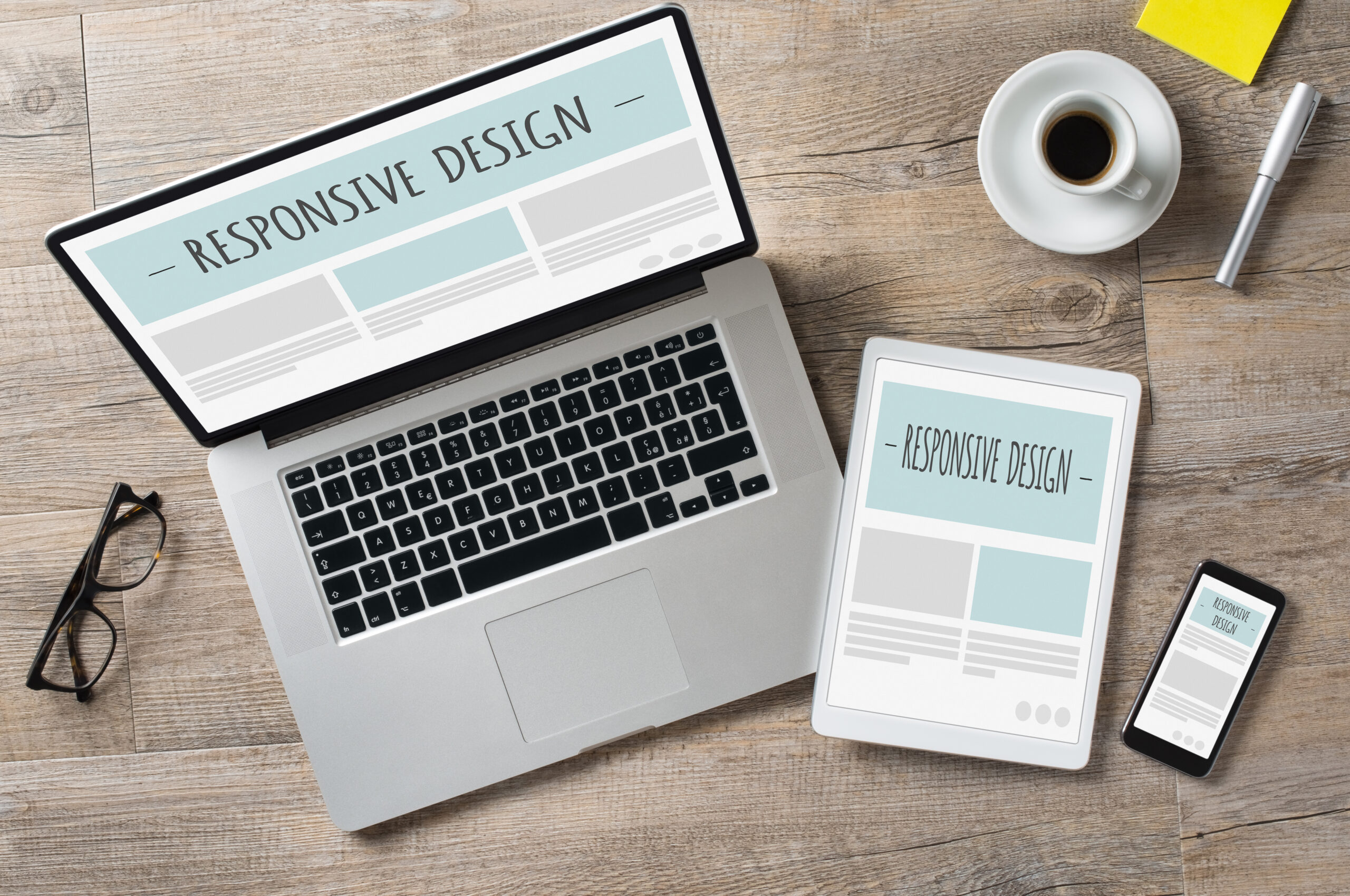
Responsive Web Design is an approach to web design that ensures a website looks and works well across a wide range of devices and screen sizes. Rather than creating separate versions of a website for different devices, responsive design allows a single website to adjust its layout, content, and design elements to provide the best possible user experience no matter what device is being used.
How Does Responsive Web Design Work?
Responsive design uses flexible grids and layouts, media queries, and scalable images to adapt a website’s design. When a user visits your site, the page elements automatically resize and reposition to fit the screen’s width. This ensures the content remains readable, images remain clear, and navigation is easy, whether the user is on a phone, tablet, or desktop.
Here are the main components that make responsive design effective:
- Flexible Grids and Layouts: Instead of using fixed-width layouts, responsive design uses percentages to allow the layout to adjust fluidly to the screen size.
- Media Queries: These are used to apply different styles depending on the characteristics of the device, such as its width, height, or resolution.
- Scalable Images: Images can be resized to suit different screen sizes, ensuring fast loading times and high quality.
Why is Responsive Web Design Important?
- Better User Experience: With more people accessing the internet on mobile devices, it’s crucial that your website provides a smooth and enjoyable experience, no matter what screen size a visitor is using.
- Improved SEO: Google has made it clear that mobile-friendly websites rank higher in search results. By implementing responsive web design, you’re ensuring that your website is optimized for SEO and has a better chance of ranking on search engines.
- Cost-Effective: Instead of creating multiple websites for different devices (mobile, tablet, desktop), responsive design allows you to maintain one site that works across all platforms. This saves you time and money in development, maintenance, and updates.
- Faster Loading Times: Responsive design can help reduce the amount of data needed to load your site, especially on mobile devices. By resizing images and adjusting elements to fit the screen, the website can load faster, which improves user satisfaction and retention.
- Increased Conversion Rates: A website that’s easy to navigate and looks great on any device will encourage visitors to stay longer, leading to higher conversion rates. Whether your goal is to increase sales, generate leads, or simply engage with your audience, responsive design plays a crucial role in achieving that.
Having a responsive website ✅
In today’s world, having a responsive website isn’t just a nice-to-have—it’s a necessity. A responsive design ensures your website delivers a great user experience across all devices, improves your SEO ranking, saves you money, and drives conversions. If you haven’t already switched to responsive web design, now is the time to start!